Previewing a Page
Previewing a page allows you to see the page as it will look when published, without region boundaries, widget menus, and other decorations that are included in the Content Viewer. Previews show the most recently saved changes to a page. If you are editing a page and have not yet saved your changes, they will not be included in the preview.
Preview is meant to be a substitute for the classic Staging environment that is needed by many content management systems. It is intended to allow content contributors, editors and administrators to see a reasonable facsimile of how the page will render on the web server. However, if your page includes HTML widgets that include server-side includes that integrate with third party applications to provide dynamic functionality or web applications, that content will not render properly in preview.
If you make changes to the page, you do not have to close and re-open the preview window/tab. Instead, just click the browser refresh button to reload the page with the new changes. Any links in the preview page open similar previews of the target page of the link.
Mobile Preview
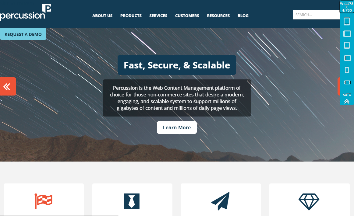
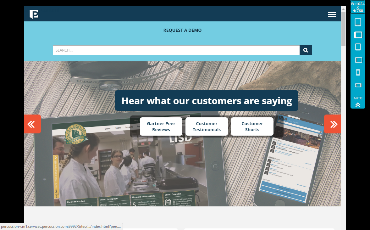
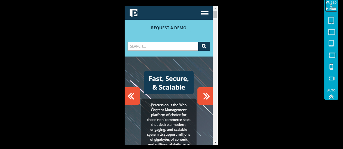
Preview includes a Mobile Preview bar that allows you to preview the page at different screen resolutions. Users can switch between different device sizes (desktop, tablet, small tablet, phone) and different orientations (landscape vs portrait). While this is not an exhaustive list of devices, the intent is to be able to preview a responsive design as opposed to device specific designs.
You can preview a page from the Finder or from the Editor.
You can test different screen sizes by using the buttons in the blue viewport control bar on the top-right hand side of the screen.


