
The Form widget enables you to build a form to capture data from your website visitors. Forms can be used for a variety of purposes -- event registration, lead capturing, satisfaction surveys, etc. The forms editor is a simple visual tool that allows you to click and drag fields to include on the from including text fields, drop downs, date fields, and checkboxes. Forms are automatically saved as a shared assets in the Assets/forms folder in the Finder.

Creating a Form
When you create a new form, a default shell form is created. The Form Title is the labels that appears on the web page above the form. The Form Name is the file name as it would appear in the Finder.

You can then add form fields by selecting the "Form controls menu" button on the right of the screen. Fields can be arranged by dragging and dropping them in the order you would like.

Styling Form Fields
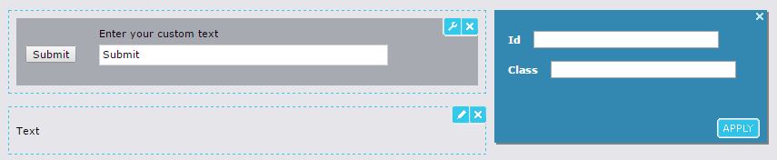
Clicking on the blue Pen icon in the top right corner of a form field allows you to edit the form details with custom text. In the editing mode you can click on the blue wrench icon to open the form styling menu where you can add Id and Class names to add additional styling from your CSS files. Your site Designer can help you add the proper Id and Class names to achieve the proper styling effects you desire.
This table lists the name and function of each control. Each control has a limitation on the number of characters. Currently this limit is 255 characters. Below the table is an annotated graphic of the registration form shown above. The registration form below the table shows how each control appears in rendered form on a web site or in preview mode.
| Name | Description | Use | Config Properties |
| Text | Instructions or other information that appears on the form. | In this field, you enter text that the form user sees, but cannot modify. Use it to enter instructions or other information. Your Web site visitors see the text you have entered but cannot edit it. To edit, enter text and apply bold, italic, or underline formatting. You can also click toolbar buttons that let you undo and redo changes. | None |
| Entry field | A one-line text field. | To edit, enter a label in the upper field, and optionally, enter default text in the lower field. | *This field is required *Maximum characters *Width |
| Text box | A box for entering unformatted text. | To edit, enter a label in the upper field, and optionally, enter default text in the lower field. Currently there is a limit of 255 characters for this field. In 5.4, there will be a limit of 2048 characters. | *This field is required *Maximum characters *Height *Width |
| Submit button | The button the form user clicks to submit the form data. | The default label on the button is 'Submit', but you can change the label. | *None |
| Date control | A single date in the format DD MMM, YYYY. | To edit, enter a label in the upper field, and optionally, enter a default date in the lower field. | *This field is required *Height *Width |
| Drop down | Drop down list of choices. | In this control, you enter a label for a drop list of choices, and enter the choices available to the form user. Select the choice that you want as the default selection. | *Width |
| Radio buttons | A list of radio button choices. | In this control, you enter a label for the radio button choices, and enter the choices available to the form user. Select the choice that you want as the default. | None |
| Check boxes | A list of check box choices. | In this control, you enter a label for the check box choices, and enter the choices available to the form user. You can select any number of options to be checked by default. | *This field is required |
| Honeypot | A Honeypot-spam filter. | This control does not require configuration. It simply needs to be added to the form; once added, it will not be visible on the published page. This control prevents bots from sending spam to the form service. | None |
| reCaptcha | A reCaptcha-bot filter. | The control requires a valid reCaptcha Site Key and provides several reCaptcha options. It will block form submission if the user is detected to be a robot. | *This field is required. |
| Data Drop Down | A list of widget types. | Can be used to select a widget configured for use with the email form service. Most useful with the Person widget. | None |

Configuring Form Behavior
You can configure the behavior of the form upon visitor submission by configuring the meta-data of the form. You can select the page where the site visitor will be redirected on both success and failure. For example, if you are using a form as a gate to control access to a white paper, after the user fills out the form, he can be directed to the page that has a link to the white paper. If you do not select a page, the CMS will redirects the user to a page that contains a generic success or failure message.
By default, when the form is submitted, the data is stored in the Percussion DTS. See Managing Form Submissions for information on accessing submitted form data. However, you can also configure the form service to submit the form to a URL that will process the submitted data.
You can also configure the system to send an email whenever a form is submitted. Enable the Notify on form submissions field to automatically send an email to the email address(es) entered in the Mail to field below upon submission of a form. This is only possible if form data is being saved to the Percussion DTS. The same data that is displayed in the Forms Tracker gadget is sent in this email. Email notifications must be configured as described in Configuring and Receiving Email Notifications.
The reCaptcha control requires configuration on the DTS server to enable the control. See Using reCaptcha with the Forms Widget for more information.
Widget Configuration Properties
Label align - Indicates where you want the labels on your rendered form to appear. Options are:
- Top of the control - (default) Labels appear above controls,
- Left of the control - Labels appear in front of the control
Widget Style Properties
CSS Root Class - A text box in which you can enter a CSS class that you want to apply to the rendered content. The styling in this class overrides any widget styling specified in the theme CSS. Your site designer can provide you with the class name.